Overview
FilmSlate is a curated indie film streaming platform with a rotating 30-day library and a growing user base driven by a popular Substack newsletter. The platform's trial-to-paid conversion rate had stalled at 32%, and leadership wanted it above 40% — but there was no defined roadmap for how to get there.
I owned the full discovery process: signal analysis, foundational research, competitor benchmarking, solution ideation, prototyping, usability testing, prioritisation, sprint planning, and stakeholder communication. This case study walks through how I moved from ambiguous data to a validated product strategy with a projected +18% conversion uplift.
Live Prototype
- Optimised for Desktop and built with Figma Make and Claude Code to demonstrate product concepts.
- Accessibility built-in with semantic HTML, ARIA attributes and colour contrast to AA standard.
- Demonstrates key journeys around: onboarding, post-watch feedback, recommendations, and RAG-powered recovery.
- Try signing up and going through the genre selection flow, or skipping selection to see a prompt on the browse screen.
- Initiate film playback and interact with the trial dialog and post-watch feedback. (hint: click the X)
- Test the RAG-powered recovery flow by navigating to the Editorial for an expired film. (hint: it's the oldest editorial piece).
What this case study demonstrates
- Data-driven problem framing — triangulating behavioural analytics, support tickets, and app store reviews to identify two distinct problem spaces from noisy signals.
- Structured prioritisation under constraints — sequencing initiatives using an impact/effort matrix with limited engineering resources, and making deliberate trade-offs with clear reasoning.
- End-to-end prototyping — designing and building a high-fidelity interactive prototype to validate concepts before committing engineering resources.
- User research that shaped decisions — foundational and usability research that directly influenced the product direction, including a recommendation to iterate rather than build.
- Systems thinking — designing features that work for both new and existing users, considering rollout complexity and data parity.
- AI-native product thinking — proposing a RAG-powered feature that uses semantic similarity to recover high-intent users, grounded in a real editorial use case.
- Quantified impact — every initiative tied to a projected contribution to the focus metric, with assumptions and risks made explicit.
The Objective
Improve trial-to-paid conversion from 32% to over 40%.
The focus metric was the trial-to-paid subscriber conversion rate. Everything else — sign-up completion, monthly active users, content engagement — was a lever that fed into it.
I had access to three data sources: behavioural analytics, customer support tickets, and app store reviews. The constraint was a small engineering team that couldn't run parallel workstreams, meaning prioritisation wasn't just important — it determined what would and wouldn't get built.
Key Constraint
The Challenge
The data pointed in two directions
Users don't trust the sign-up process
34% of users dropped off before completing sign-up. The payment gateway — the single most reported issue at 22% of all support tickets — required card details before any value was delivered. App crashes and tablet failures compounded the problem, but the reviews revealed something deeper than technical bugs: the sign-up flow felt untrustworthy.
"Why do I need to enter payment details before the free trial? Sketchy."
— App store review, 1 star
The tablet app was particularly affected. Despite tablets having a 16% share of devices used for streaming, they accounted for just 5% of FilmSlate sign-ups — a gap almost entirely attributable to the app failing to load.

Users want a deeper connection to the films
Around 1 in 6 reported issues related to difficulty finding content. 60% of subscribers watched fewer than three films per month, and many were leaving the app entirely to research films on Google. Users who did complete at least one full film were 2.5x more likely to convert to paid — making content relevance a high-leverage factor.
App store reviews pointed not just to a filtering or recommendation problem, but to a desire for the editorial warmth that made the Substack newsletter popular. The app felt impersonal by comparison.
"Finding something to watch takes forever. The app feels impersonal."
— App store review, 3 stars

Fix What's Broken First
Technical fixes — payment gateway timeouts, app crashes, and the non-functional tablet app — were prioritised first. They clustered into the "quick wins" quadrant of the impact/effort matrix: low effort to implement, high impact on the conversion rate.
Fixing these issues was estimated to contribute +4% to the trial conversion rate, driven primarily by recovering the tablet sign-up shortfall (from 5% to an expected 14% of all sign-ups) and reducing the overall sign-up drop-off rate.
Key Decision
The Biggest Lever Was Personalisation
With the technical foundation addressed, the largest projected impact (+8% to conversion) came from helping users find content that felt personally relevant.
The data supported this from multiple angles: behavioural analytics showed low film completion rates, support tickets flagged discovery friction, and app store reviews explicitly requested smarter recommendations. Competitor analysis reinforced the opportunity — MUBI and Flix Premiere had built identities around community and curation respectively, but neither had invested in individual personalisation. This was FilmSlate's chance to differentiate.
Competitor Positioning
Research confirmed the direction
Before jumping to solutions, I conducted foundational research with participants of differing age, gender, and ability. The goal was to reduce the risk level of assumptions and increase confidence in the problem and solution space.
Two findings were particularly important. First, participants don't actively search for content — they pick from what is surfaced and anchor decisions in their known tastes. This reframed the problem from "users can't find content" to "we're not surfacing the right content for them." Second, participants are highly sensitive to trust, value, transparency, and relevance when deciding to join and stay with a platform — validating both the paywall and personalisation directions simultaneously.
Key Decision
What I Designed and Built
Experience 1: A feedback loop that learns what you love
I designed and built a high-fidelity interactive prototype in Figma Make (with a fast-follow in Claude Code) that demonstrates a three-part personalisation system:
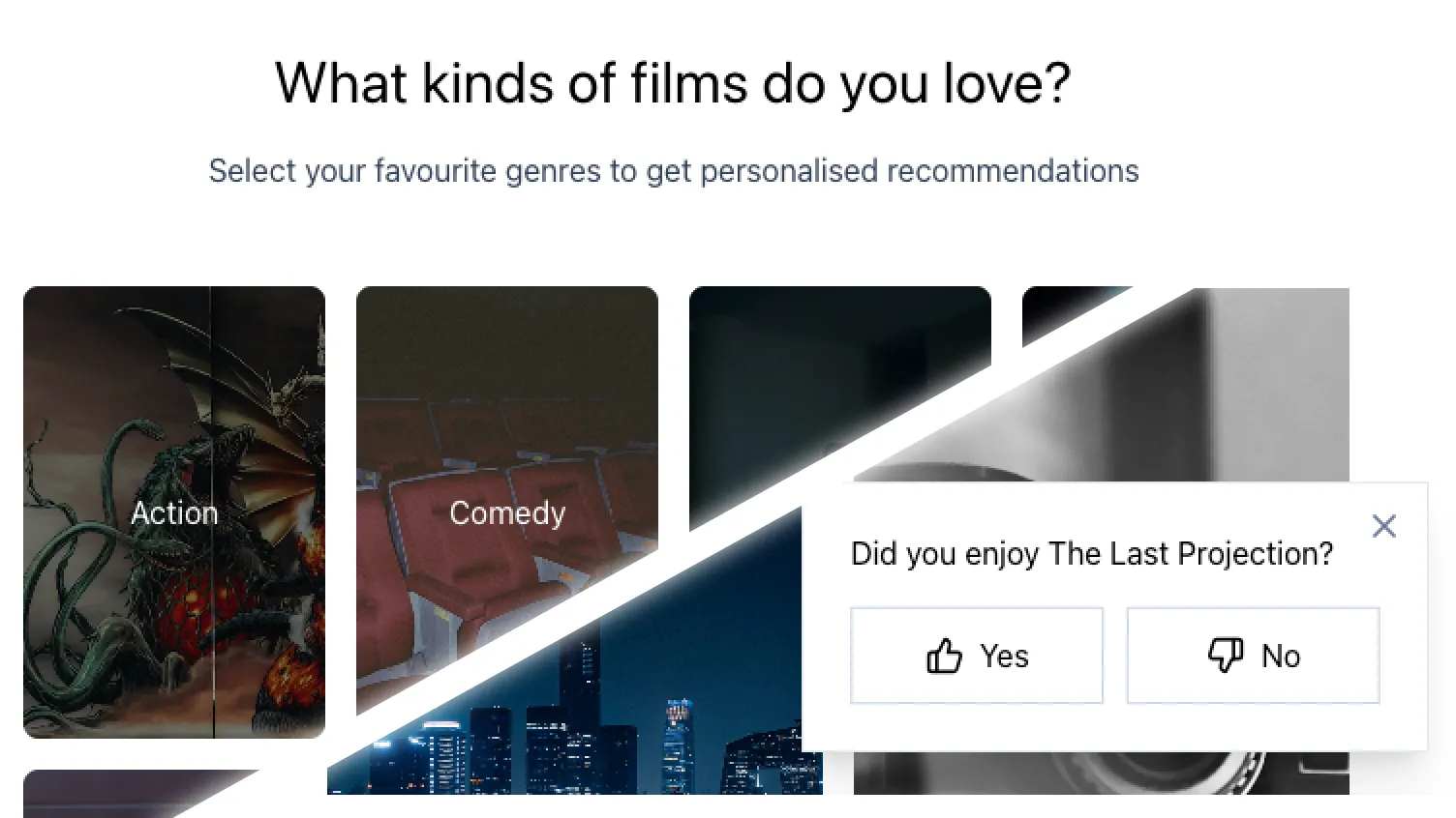
- Capture genre preferences during sign-up.
Users select from visual tiles representing genres (Action, Comedy, Horror, Romance, Sci-Fi, Drama, Thriller, Documentary). This step is low effort for the user but immediately seeds a basic taste profile. It's optional and skippable — but usability testing showed all participants chose to complete it, indicating it was perceived as value-adding rather than friction.
- Post-watch feedback.
After a user stops watching a film — whether they finished it, paused, or navigated away — a lightweight prompt captures whether they liked it. This signal feeds back into the taste profile, allowing recommendations to evolve over time.
"For You" recommendations.A dedicated section on the browse screen surfaces films aligned with the user's taste profile. This is the visible output of the feedback loop — the moment the user sees that FilmSlate understands them.
These three touchpoints form a continuous loop: preferences seed the profile, feedback refines it, and recommendations reflect it.
Solution Ideation Process
Personalisation that works for existing users too
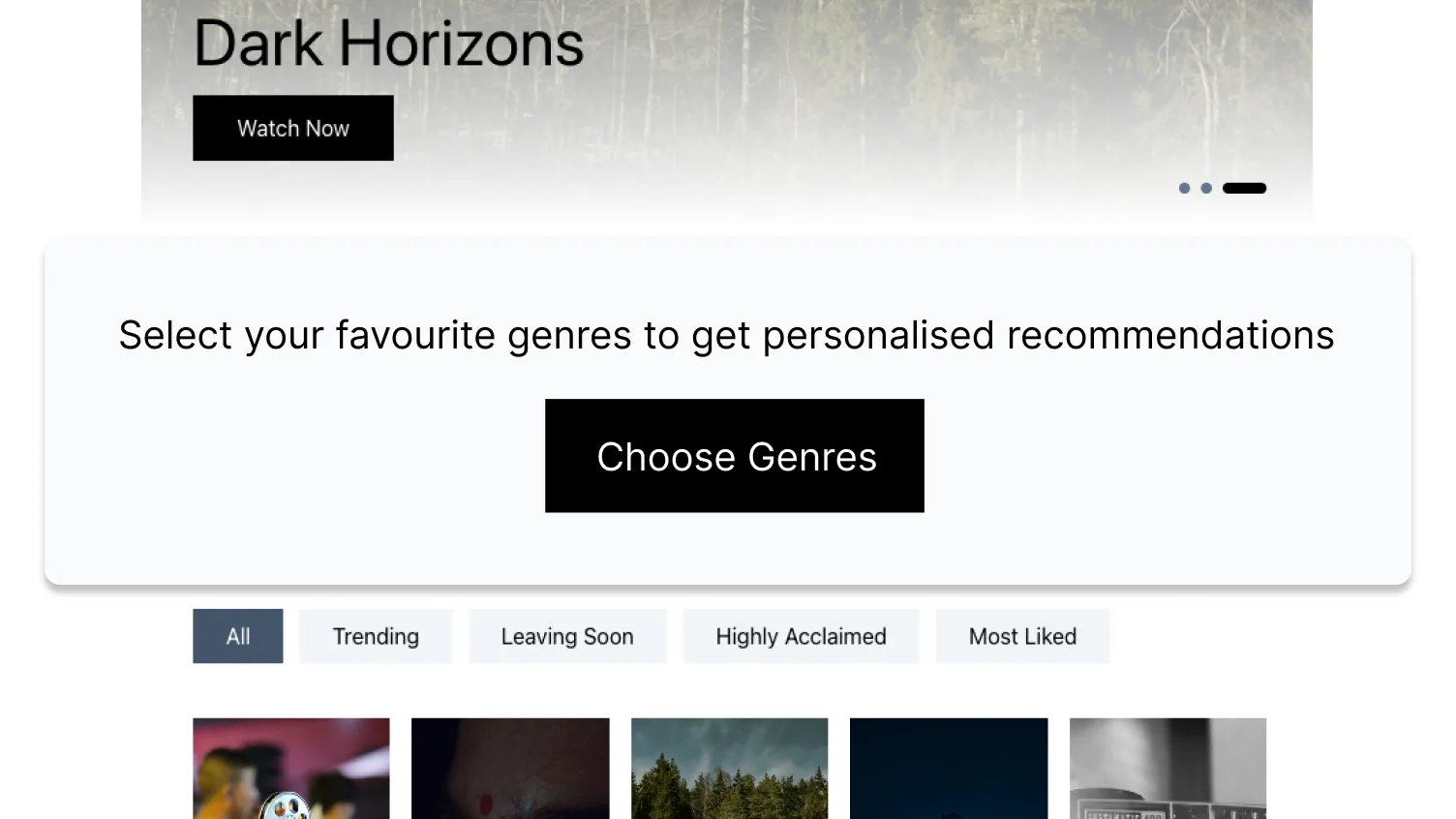
A common trap with onboarding-based features is that they only benefit new users. FilmSlate's existing subscriber base — the people already paying — would miss out entirely, creating a data parity problem where the recommendation engine has no signal for a significant portion of users.
To solve this, the genre preference step is designed as a standalone interaction that can surface in two contexts: during sign-up for new users, and as a contextual prompt on the browse screen for existing users who don't yet have preferences set. The prompt is non-blocking and dismissable, but positioned at the moment a user is actively looking for something to watch — when it's most relevant.
This means the recommendation engine can serve the entire user base, not just the newest cohort, and preference coverage can grow incrementally toward the 60% target set in the OKRs.
Key Decision
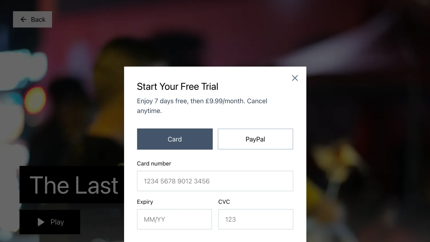
Experience 2: Move the paywall to the moment of intent
The original sign-up flow required payment details as the final step before accessing the platform. For a 7-day free trial, this felt premature — users were being asked to trust FilmSlate with their card details before seeing a single film or experiencing any personalisation.
The redesigned flow defers the payment step to the moment a user taps "play" on a film they want to watch. This means users can create an account with just their basic details, optionally provide genre preferences, browse the full catalogue and film detail pages, and see their personalised
This builds trust incrementally: the user has explored the platform, seen value, and made an active choice before the paywall appears. It also reduces the blast radius of payment gateway failures — if the gateway is down, users can still browse instead of being locked out entirely.
Key Decision
Experience 3: Recovering high-intent users with RAG
FilmSlate's content library rotates every 30 days, but Substack posts are permanent. Over time, an increasing proportion of newsletter links will point to films that are no longer available. For a reader who's just been compelled by an editorial to watch a specific film, landing on an "unavailable" screen is a dead end — and likely the last interaction they have with FilmSlate.
I proposed a deep-link feature that detects when a linked film has expired and uses retrieval-augmented generation (RAG) to recover the moment. The system compares the original editorial text of the expired film against the editorials of all currently available titles using semantic similarity. It then surfaces three alternative recommendations ranked by relevance.
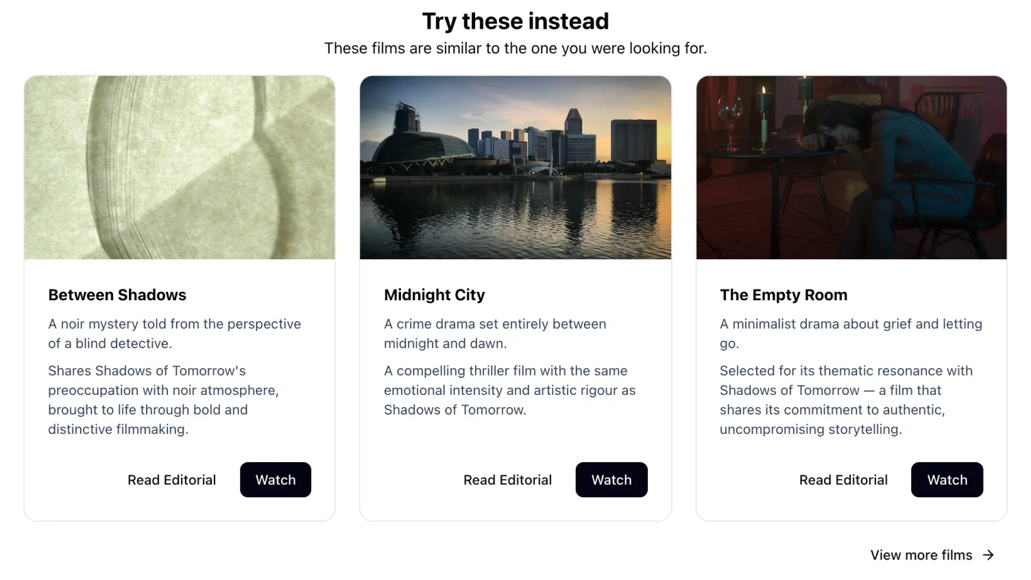
This approach preserves the editorial voice — recommendations are grounded in the same kind of curated writing that brought the user to FilmSlate in the first place, not generic metadata matching. It turns a potential churn moment into a discovery opportunity.
Technical Approach
Usability Findings
A moderated usability study was conducted with the high-fidelity Figma prototype.
What worked
- All participants chose to provide their genre preferences during sign-up, confirming this step is perceived as value-adding, not friction.
- Most participants viewed a recommended film's details first, showing that the
"For You" section successfully captures initial attention. - All participants understood how recommendations were generated.
- All participants chose to begin the free trial.
What needs refining
- All participants continued browsing the full catalogue after viewing recommendations. The
"For You" section oriented them but wasn't sufficient on its own to drive a confident selection. Further investigation is needed to understand whether this behaviour is limited to new users being in "explore mode". - When asked to skip genre selection during sign-up, fewer than half of the participants engaged with the in-app prompt on the browse screen. Further investigation is needed to determine whether existing users engage with this prompt.
Key Decision
Accessibility
Accessibility was treated as a build constraint from the outset rather than a post-launch consideration. The usability study included participants of differing ability, which meant the prototype needed to meet an accessible standard before any testing began. Following the study, a full accessibility review was conducted across all components and views against WCAG 2.1 AA — it found a solid foundation alongside a prioritised set of issues to address before launch.
Where the prototype performs well
- Semantic HTML and landmark structure. The main landmark is applied correctly to every page-level view. Article elements wrap critique content. The film detail page uses an aside element with an explicit label. HomeScreen content sections carry aria-label and aria-labelledby attributes, and the category strip is marked up as a nav element — giving screen readers a coherent, navigable document structure throughout the app.
- ARIA attributes. Carousel navigation dots carry individual aria-labels and aria-current to communicate position within the sequence. Genre preference toggles use aria-pressed to expose their selected state to assistive technology. The payment dialog includes all three attributes required for a correct modal pattern: role="dialog", aria-modal, and aria-labelledby pointing to the dialog title. Decorative icons are marked aria-hidden throughout every component, preventing icon names from leaking into the accessibility tree.
- Keyboard navigation and tap targets. All interactive elements — movie cards, carousel controls, genre toggles, form inputs, and the playback close button — use native button or anchor elements, requiring no custom keyboard handling. Form inputs carry associated label attributes. The shared Button component uses focus-visible to display a keyboard focus ring only during keyboard navigation, not on mouse click.
- Colour contrast and scrims. Wherever text sits directly above a film poster or background photograph — on the browse screen, film detail page, and landing screen — a semi-transparent scrim is applied beneath the text layer. This makes legibility a deliberate design decision rather than an accident of image content, ensuring text contrast is controlled regardless of what the underlying photograph contains.
Projected Impact
| Initiative | Mechanism | Projected Impact |
|---|---|---|
| Fix technical blockers | Recover tablet sign-ups, eliminate payment gateway failures, fix app crashes | +4% |
| Personalised recommendations | Genre preferences → taste profile → | +8% |
| Streamline sign-up | Defer payment to moment of intent, let users explore before committing | +4% |
| RAG deep-link recovery | Recommend alternatives when Substack links point to expired content | +2% |
| Total | +18% |
This would take the trial-to-paid conversion rate from 32% to approximately 50%, exceeding the 40% target. In revenue terms, the combined impact translates to over £1m in additional annual subscriber revenue.
Assumptions & Risks
- Technical fixes recover the full tablet sign-up shortfall
- The conversion rate of users who complete a film holds at 2.5x the baseline
Lessons Learned
Prototypes uncover hidden assumptions
Building a high-fidelity interactive prototype didn't just communicate the vision — it surfaced refinements that would have been invisible in a written specification. The usability study revealed that personalised recommendations capture attention but don't yet drive confident selection on their own. That finding directly changed the recommendation: iterate on the prototype before committing engineering resources, rather than building immediately.
This is the design-engineering loop in practice. The ability to build something testable — quickly and at high fidelity — compresses the feedback cycle and produces better product decisions.
The usability feedback also highlighted the importance of validating ideas, even if it seems the solution is clear.